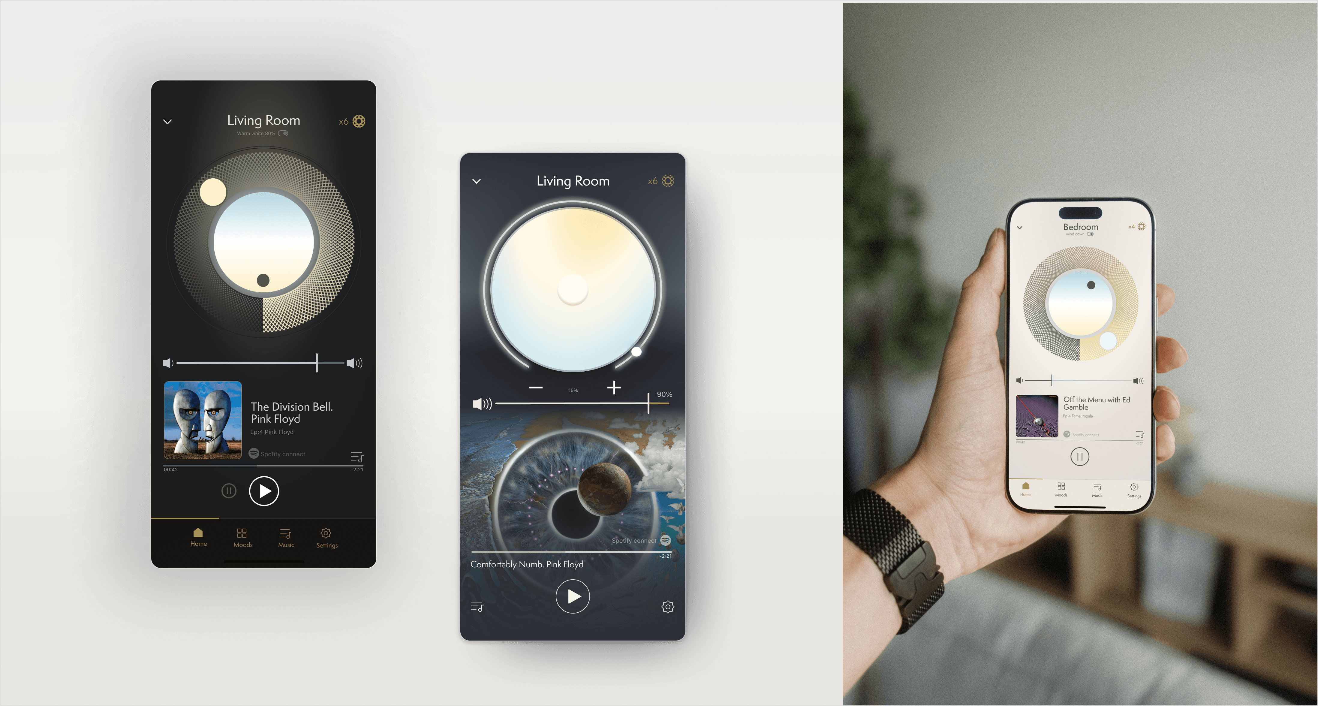
Orluna is a British lighting manufacturer known for precision engineering and high-quality downlights. Yet their digital presence hadn’t kept pace with the brand’s ambition, the website felt dated and out of step with the premium, design-led image they wanted to project. To reposition the brand in the aspirational lighting category, they needed a modern website paired with a complete rebrand, that could balance technical product specifications with inspirational storytelling.
2020 - 2023
LUXURY LIGHTING, CREATIVE, IOT
OLI GEAL, SHANE HORN, DAVID MCLOUGHLIN, FOUND STUDIO, GONZALO MIRANDA
scope
Every day we take the experience of light for granted. It flows in the spaces we walk through, caresses our skin, it has the power to elevate or dampen our emotions. As breathing, it’s invisible. Without it, we wither away.
With a catalogue of over 1000 products and six audience categories, striking the right balance on a tight schedule was no easy feat. As UX Designer my role was to help the client embrace a radical change while designing a stunning responsive site the team at Brave could build on a strict schedule.
a new website to support rebrand
Working with Brave in London, I led the UX strategy, information architecture, and content direction for a new responsive website.
The challenge: design a platform to serve over 1,000 products and multiple user groups, from architects and designers to sales teams and back-office staff, while elevating the brand into a more competitive, design-led space.
During discovery, I focused on building a deep understanding of the business and its products. I conducted one-to-one conversations with stakeholders, business leads, Brave’s PMs, the creative director, and internal designers. I chose one-to-one chats rather than group meetings to capture informal insights that might otherwise be missed.
researching sales and production pipeline
I also insisted on visiting Orluna’s production plant. Talking to the business directors and seeing the production line gave me first-hand understanding of what made Orluna unique, the craftsmanship, technical precision, and small details that reinforced its reputation as a leading manufacturer.
Finally, I carried out a competitor review. Most competitors had strong but conservative identities, often family-owned businesses, with a focus on high-end real estate. Their communications tended to be masculine and traditional. This helped us define where Orluna could stand out.
profiling the user base
From these conversations, I built both user and buyer personas.
The site had to serve two main groups:
External users: designers, architects, and the general public.
Internal users: the sales team (using the site to support storytelling and sales) and the back-office team (helping interior designers spec products).
A key pain point emerged: finding product specifications quickly and adapting them for architectural layouts, competition submissions, or quotes was hard.
The new website needed to work as both a showcase for the refreshed brand and a technical product database. Over time in discovery, we driilled down into more granular scenarios:
Users familiar with the Orluna range: homepage > search by name/product code/luminaire type (search criteria to be validated) > product overview page > product detail page > spec table / copied code > product specs printout
New customers: explorative mindset: search engines/homepage > product filters and/search > product overview > product detail page > bookmark and compare products > contact page
Users somewhat familiar with Orluna and the range: search engines/homepage > product families (new functionality) > product overview > product detail page > bookmark and compare products > contact page
website audit and information architecture
The company live site needed a deep visual refresh, but more over needed to perform for a wider range of use cases as the company was expanding.
With Brave’s full-stack developer, I reviewed Orluna’s existing CMS and the current state of their product range, taxonomy, and categories.
Together we mapped out the new database structure, technical specifications, and filtering system. We worked closely with company directors to align on the best way forward.
Two workstreams ran in parallel.
Product database – defining all technical data points.
Site architecture – planning the overall structure and navigation.
three months to future proof technical and editorial content
Our goal was to inspire designers by showing what’s possible with light. Instead of just posting product shots, we built a strategy around celebrating the lit effect and the creativity behind it. The content types looked like this:
Beautiful Projects – Share our own photography, but also collaborate with designers by reposting their work (with credit) to highlight real-world applications.
Beautiful Lit Effect – Capture the quality of light through close-ups, textures, and even CGI, all within a consistent, ownable visual style.
Imagination & Inspiration – Talk about what drives us: from high-CRI light that brings out artwork, to dimming that shifts emotion, to innovations in smart lighting.
Techniques & Expertise – Offer inspiration and guidance on lighting techniques, positioning Orluna as the go-to expert in the lit effect.
Mastery & Process – Pull back the curtain on design: from sketches and CAD drawings to behind-the-scenes stories that reveal the craft.
New Product Highlights – Share launches sparingly, focusing on beautifully shot images and clear, meaningful benefits.
We designed every page as a modular component set, easily stackable via the CMS. Three primary user journeys shaped the structure:
Sales team using the site to support funnel conversations.
Interior designers and architects specifying products for drafting, competitions and quotes
General users and press browsing editorial brand content.
To enhance storytelling, each product range was paired with a themed room visualisation. These 3D visuals were reused across the website, social media, and print.


